Friday 18 May 2012

Context Sheet.


Here I have collated some of the key inspirations and ideas that have lead to my final design visualisation. Showing colour ideas, fabric samples before being dyed or printed, artists/designer inspirations, layers of drawings that lead to the idea of layers of fabric, hanging samples, and also some close ups of the marks on the samples. This context sheet sums up the visual inspirations for my project.

Final Visualization

 
Visualizing my work proved to be more difficult to convey than i first assumed. My initial attempts on photo shop didn't give the impression of draping fabric that I felt was an important element of my design. Thus, I instead printed out an artists interpretation of the Cafe area of the New School and hand painted my design loosely with water colours. I think this has worked successfully. I wanted the fabric to be draped from above, mimicing the shapes in Gothic Vaulting and the Gothic Arch. my first attempt (left) didn't translate this effectively enough; I decided the fabric should hang from one point on the ceiling, rather than several. My final visualization (right) works much better; suggesting weight in the fabric and translating, far more effectively, the shapes and forms of Gothic Architecture.

Final image

Layering my best samples for my final 'strong images' works successfully. I like the 'reveal and conceal' effect the laser cut leaves gives.


 These 3 images were my initial options for my 'strong image', however, I decided they weren't interesting enough and didn't do my detailed prints justice - I also felt thet needed a good iron!

Wednesday 16 May 2012

Final Image.


One Strong Image - to try and portray the different layers and textures to the fabric. Details are not crystal clear here, but are still visible, and I think it’s more important to get a feel for the piece as a whole than for individual aspects of one sample.


Final Design Visualisation


Final Digital Visualisation - building drawn in Illustrator using Vectors. Showing a hanging space underneath the lanters, allowing light to shine down and through the translucent materials.


Design Visualisation Experiments


Experimenting with different locations for my design proposal. I used both the artist impression images and also drew out my own space using vectors on Illustrator.

I think that there might be too many distractions in the artists impression proposals; your attention is not initially on the piece of work. So I think I will go with a vector design...


Gothic Vaulting

Thinking about my design proposal - I am keen to translate the organic shapes of Gothic Vaulting into the draping of my printed fabrics. The Town Hall's traditional Gothic Arch becoming something contemporary with movement and pattern in the New School.

Tuesday 15 May 2012

Illustrator Help... courtesy of Mellisa Ward!

Mellisa from Living It group 4 told me today about a little post on her blog about Illustrator, so if anyone is wanting to create objects or even entire rooms for their design proposal this might help!

http://livingit-group4.blogspot.co.uk/2012/05/making-your-own-vectors.html


Also check out her room design for ideas of what it can look like...


http://1072981406.blogspot.co.uk/2012/05/digital-visualisation-so-far.html

Artist Work


I also saw Lucy Browns work at Plattfields Gallery, this piece was called gone through the mill, and was hung from the ceiling. I love all the different sections and materials used in her weaving. 


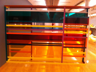
I also found this piece by Francesco Quarto Colossa in the Liverpool Tate interesting as a partition for the new art school. 


I like the idea that the partition I make will allow students some privacy, although still have small sections of cut out or transparency. 


Lucy Brown


I love the way Lucy Brown creates large weaves using sections of tight weave against large open draping sections of thread, I think this makes a much more interesting form. I want to keep this in mind when creating my own weave. 

Ideas..

I really enjoyed my last workshop, weave, therefore have chosen to use this technique as my final design but taking a hand weave approach. This should be easier to create a large scale weave which can be used not only as art in the new building but as partitions in the open plan workspaces. Linking back to Claustrophobia, I am going to trap hair in my weave representational of Claustrophobic's feeling uncomfortable in trivial matters such as getting a hair cut. I also want to include clothing also linking to Claustrophobia as they tend to remove clothing when having an attack. I think this could be an interesting idea for the new building, as this can create a little privacy for students, however it is easily portable as Ursula said in a previous post there are white rails that run along the ceiling allowing work to be hung from.


Visualization

http://www.internimagazine.it/special-events/interni-legacy-2012/installazioni- installazioni was helpful in seeing both digital and hand draw visualizations

Here designer, zhang Ke has used a 3D model to visualize his architectural structure. I would assume the 'Village Mountains' were visualized in this media to test their stability as standing structures.


 This design in particular has inspired me to draw my visualisation by hand. I love the simplicity and personal quality this traditional technique can produce.

Monday 14 May 2012

Liz Nilsson

The Lost in Lace Exhibition was great...and the website has all the artists on if you fancy taking a look. There's some space dividing things that would probably be useful to you Hannah.


Fabric.


Using lightweight fabrics as well as heavier ones was important for me, being able to layer up different marks being crucial. This reflects the idea of marks built up over the years, traces left behind. One on top of the other. Building up. Translucent materials also lent themselves well to subtle marks, almost hidden and yet slightly revealed.

Print Marks.

Experimenting creating marks with different print techniques- discharge, devore, and clear pigment.
The marks impacting onto the fabric and leaving a trace, but rather than just being printed on top are burning into, or bleaching the fabric. Using the clear pigment although barely visible, shows hidden marks only just becoming visible. All of the marks are subtle which I like as it seems like they are old, worn, historical marks from a past existance.
Fiona Curran's talk today was an interesting insight into how a designer's initial drawing or idea can become a visualization for an instillations and then a physical installation. The journey between these points in design is exciting; all designers must overcome one obsticle or another to achieve their final outcome.

I like how, instead of a drawing becoming a 3 dimentional piece, Curran has worked in the opposite way here; an origami style experiment has become a paiting. The series of paintings were then the inspitration for a collaged wall instillation in a hospital waiting room.

In these wall prints, Curran's stylized natural imagery seems to grow in a very organic way from the floor.

Sunday 13 May 2012

Karl Blossfeldt

 Blossfeldt photographed natural forms in great detail; highlighting their natural structures. The high contrast black and white images makes these fragile forms look like very strong, solid structures. These images have very similar qualities to the natural forms in the exterior decor of the Town Hall.

Girli Concrete

Girli Concrete uses patented technology to embed fabric within he surface of concrete; transforming something cold, grey, acoustically harsh and unappealing into something very warm, colourful and decorative.
The concept of embedding pattern and decorative design into concrete is used in aspects of Gothic Architecture- similarly to many aspects of gothic architecture, Girli Concrete designs are often inspired but natural imagery and forms.
The Gold detail in these designs looks almost embroidered

Saturday 12 May 2012

Tord Boontje

 Boontje's studio’s designs take inspiration from nature, and employ a décor of forms and layers to engage and entice an observer’s imagination and emotions. Light plays an important role within his designs; the patterns cast in shadows by his laser cuts are often as much a part of the design as the 3 dimentional pieces.

 Boontje's 'fabric room' takes inpiration from architecture; Guadi's buildings in Barcelona in particular. I like the way draped fabric folds itself into very organic shapes. The 'fabric room' has inspired me in the development of my project. I'd like to use my own printed fabrics to drape, mimicing the organic shape of the gothic arch; perhaps also laser cutting ino the fabric and using light in my design. Boontje's design is about entering an 'experience'; there is something comforting about being surrounded by a blanket of draped fabric.

Wednesday 9 May 2012

Terri Bibby

I found this great weave designer, Terri Bibby, who organises classes for other textile designers to learn and make a contribution to her work. The particular work i was fond of is the below exhibition called Voice in Three Strands, where Terri exhibited her installation piece called, Peace Banner, where 150 people contributed to the creation of it. I wanted to share this with you guys as i absolutely love this idea of interaction with the viewer and exploring the weave in depth, which is something im going to look into for my weave pieces. Hope you enjoy!

Peace Banners at ArtCraft
Here is the URL for Saori Salt Spring website where Terris work is, if you wanted to take a look at her other works...